All I can think of regarding the graphic is the designer realized they couldn't fit all iterations on the panel, so decided to make a creative compromise. Poor choices, if that was the case. Omitting the jersey of DeWalt/Fernandez (as mentioned by squishy35 in another thread) was a big mistake. The logo was the template for today's, but had the strange logic of having the dark lion. Someone must have decided to go for closer to what the mountain lion native to BC would like like when they made the lion orange in '89. I would like to know the story of the designer of both versions. Was it the same artist, or did another one modify it?David wrote: Wed Sep 18, 2019 8:25 pmI am actually partial to the middle uniform with the 7 burnt orange stripes on the sleeves and the burnt orange and white neck trim. However, they only wore those for two seasons (1970 and 1971 - note: the mistake on the print, which reads "1974").BC 1988 wrote: Wed Sep 11, 2019 7:26 pm I see the "No Mountain Too High" graphic (available framed on Amazon) is pretty condensed--they forgot the '80s reversed lion which I like.
I am actually surprised they didn't feature the 1978 uniform instead. This is when the club switched colours to burnt orange and brown (and the new logo, which is primarily the one they still feature today). They achieved a lot of success in those uniforms (including the 1985 Grey Cup).
DH
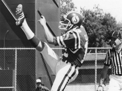
I remember seeing the '70-71 uni in color when I was a kid in Toronto (on player cards, but they didn't feature the '71 Centennial helmet, which I finally saw earlier in this thread). The stripes on the sleeves were like a version of what HAM had at that time