
New BC Lions Jersey for 2016
Moderator: Team Captains


As someone old enough to remember when the TiCats didn't even have their logo on the helmet, I tend to agree.DanoT wrote:And I like the pre 2004 TiCat logo way better than the current one which looks a bit cartoonish. The old tiger logo is more ferocious.
But that's the point, the CFL doesn't need to attract old fans like us. They need to appeal to the young, and maybe more cartoonish is the way to go.
-
Hambone

- Hall of Famer
- Posts: 8218
- Joined: Mon Nov 01, 2004 10:25 pm
- Location: Living in PG when not at BC Place, Grey Cup or Mazatlan.
Only problem with that is while 3rd jerseys usually do fly off the shelf right away sales quickly tail off. That's why 3rd jerseys tend to have a short shelf life. About the only time they have any longevity is when a team decides they like them enough to make them their full-time togs. Otherwise they are usually moth-balled after a season or two to be replaced somewhere down the road by yet another rendition of the 3rd jersey cash grab.CardiacKid wrote:The way the gun-metal jersey flew off the shelves when first introduced, makes me think they contributed a healthy dose of $ to the Lions bottom line. If he has a problem with that, I would be more than happy to help relieve his discomfort by getting some of our $ backDavid wrote:I also have it on good authority that the only reason we did not return to the gun metal jerseys for a game or two this year is because Skulsky doesn't like them. He thinks our identity is orange and should stay in the current colours.
DH
You're as old as you've ever been and as young as you're ever going to be.
True. Third jerseys have a lifespan of one or two years. The gun metal caused a flurry of excitement a few years ago but that's long gone.Hambone wrote:Only problem with that is while 3rd jerseys usually do fly off the shelf right away sales quickly tail off. That's why 3rd jerseys tend to have a short shelf life. About the only time they have any longevity is when a team decides they like them enough to make them their full-time togs. Otherwise they are usually moth-balled after a season or two to be replaced somewhere down the road by yet another rendition of the 3rd jersey cash grab.CardiacKid wrote:The way the gun-metal jersey flew off the shelves when first introduced, makes me think they contributed a healthy dose of $ to the Lions bottom line. If he has a problem with that, I would be more than happy to help relieve his discomfort by getting some of our $ backDavid wrote:I also have it on good authority that the only reason we did not return to the gun metal jerseys for a game or two this year is because Skulsky doesn't like them. He thinks our identity is orange and should stay in the current colours.
DH
This logo has been posted here before:BC 1988 wrote:As someone old enough to remember when the TiCats didn't even have their logo on the helmet, I tend to agree.DanoT wrote:And I like the pre 2004 TiCat logo way better than the current one which looks a bit cartoonish. The old tiger logo is more ferocious.
But that's the point, the CFL doesn't need to attract old fans like us. They need to appeal to the young, and maybe more cartoonish is the way to go.

While I am not saying this should become their new logo, it has the aggressive, vectored, modern design that attracts the younger fan and IMHO, that is the direction the Lions need to head in. How? Here are two ways to approach it:
A. Introduce it as an alternate logo, only appearing on a 3rd jersey and certain merchandise lines. Slowly increasing its presence over time. If it fails to attract attention it can die with the jersey it was introduced on.
B. Completely replace the original logo in one swoop. Example, Seahawks.
Management hasn't even hinted that a logo change is being considered and with Skulsky running the show I guarantee its never going to happen. Skulsky needs to keep that core 15K - 20K (what was it, 90K income/yr) fan happy and those are going to fall under the older, deep in tradition & heritage fan.
-
Hambone
- Hall of Famer
- Posts: 8218
- Joined: Mon Nov 01, 2004 10:25 pm
- Location: Living in PG when not at BC Place, Grey Cup or Mazatlan.
I think what happens is there is the contingency of fans who see it and immediately must have it. Then there's the contingency of the majority who may have a differing opinions on a 3rd jersey. Some may not like them. Some may think they're quite OK. For the most part though if they're going to invest in a jersey they want to spend their coin on the look the team wears all the time, not just a game here and a game there.B.C.FAN wrote:True. Third jerseys have a lifespan of one or two years. The gun metal caused a flurry of excitement a few years ago but that's long gone.
You're as old as you've ever been and as young as you're ever going to be.
You know, I actually like that vectored Lion logo. The old "stoned lion" look is getting stale (the 2005 update was minimal, and never was very aggressive looking). I use the 1980-88 logo as my avatar because I moved here in 1988, and I also like it more than what it was changed to (even if the black color makes no sense for a BC mountain lion).Spud387 wrote:This logo has been posted here before:BC 1988 wrote:As someone old enough to remember when the TiCats didn't even have their logo on the helmet, I tend to agree.DanoT wrote:And I like the pre 2004 TiCat logo way better than the current one which looks a bit cartoonish. The old tiger logo is more ferocious.
But that's the point, the CFL doesn't need to attract old fans like us. They need to appeal to the young, and maybe more cartoonish is the way to go.
While I am not saying this should become their new logo, it has the aggressive, vectored, modern design that attracts the younger fan and IMHO, that is the direction the Lions need to head in. How? Here are two ways to approach it:
A. Introduce it as an alternate logo, only appearing on a 3rd jersey and certain merchandise lines. Slowly increasing its presence over time. If it fails to attract attention it can die with the jersey it was introduced on.
B. Completely replace the original logo in one swoop. Example, Seahawks.
Management hasn't even hinted that a logo change is being considered and with Skulsky running the show I guarantee its never going to happen. Skulsky needs to keep that core 15K - 20K (what was it, 90K income/yr) fan happy and those are going to fall under the older, deep in tradition & heritage fan.
-
Honour Dewalt
- Champion
- Posts: 530
- Joined: Wed Nov 27, 2002 11:21 pm
I think that logo you are referring to as " the vectored logo is pretty terrible, and would never want something so cartoony looking. But if the point of showing that refers to a Seahawks equivalent logo update, then I'd be ok with that. It does not look cartoony, just more modern.
One thing they definitely need to change is that font on the front of the jersey, just above the numbers. This is very 90's looking with the italics and block outline. They have been using a much more straight up and down font lately for other merchandise, which fits with today, and that should be updated for the jersey too.
I'd be worried about this current group doing anything to the logo though. They'd probably cheap out and arrive at some pretty shabby outcome with no modern design sense. Although maybe that isn't a fair comment, since they did come up with a pretty cool third jersey.
IMO, the Seahawks update (essentially done in 2002, 2012 was just a minor color tweaking) was a real improvement over the original 1976 sad sack look. The main change was the fierce expression in the eye.
http://www.sportslogos.net/logos/list_b ... _Seahawks/
http://www.sportslogos.net/logos/list_b ... _Seahawks/

The problem with the old TiCat logo was that the level of detail in the black & yellow colouring was too busy, which meant it didn't scale down to small sizes very well. It's like if you drew a picture of a maple tree and tried to draw on it every last individual leaf. The newer logo, with a lower spatial frequency of colour change across the field of view, is more easily reproducible at a range of scales.BC 1988 wrote:As someone old enough to remember when the TiCats didn't even have their logo on the helmet, I tend to agree.DanoT wrote:And I like the pre 2004 TiCat logo way better than the current one which looks a bit cartoonish. The old tiger logo is more ferocious.
But that's the point, the CFL doesn't need to attract old fans like us. They need to appeal to the young, and maybe more cartoonish is the way to go.
Sports can be a peculiar thing. When partaking in fiction, like a book or movie, we adopt a "Willing Suspension of Disbelief" for enjoyment's sake. There's a similar force at work in sports: "Willing Suspension of Rationality". If you doubt this, listen to any conversation between rival team fans. You even see it among fans of the same team. Fans argue over who's the better QB or goalie, and selectively cite stats that support their views while ignoring those that don't.
-
CardiacKid

- Legend
- Posts: 1949
- Joined: Sat Jul 14, 2012 9:46 am
- Location: Under Christmas Hill, Saanich
I think the above point is exactly why the TiCats under Bob Young changed the logo. It was far too busy and wouldn't scale well for digital media. Any logo has to look good on a website and related content, particularly in this day and age when mobile devices such as tablets and smartphones have the capability of zooming in and out of content at a touch.sj-roc wrote:The problem with the old TiCat logo was that the level of detail in the black & yellow colouring was too busy, which meant it didn't scale down to small sizes very well. It's like if you drew a picture of a maple tree and tried to draw on it every last individual leaf. The newer logo, with a lower spatial frequency of colour change across the field of view, is more easily reproducible at a range of scales.BC 1988 wrote: As someone old enough to remember when the TiCats didn't even have their logo on the helmet, I tend to agree.
But that's the point, the CFL doesn't need to attract old fans like us. They need to appeal to the young, and maybe more cartoonish is the way to go.
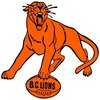
The Lions have gone through a number of logos and variations to logos as have the other clubs. How many remember the BC Centennial logo that adorned the helmet for a very brief time? My retro favorite is of course the logo from the 70s as it has a connection with the time I truly started watching the team. Other teams have changed their logos plenty and some from yesteryear have appeal, either from a graphic standpoint or nostalgia. But plenty really just look truly kitschy.
What I have often thought is why not have a retro or classic line of apparel for each team? Keep the current logo and any future variations front and centre on the jersey, sideline gear, etc. but have a group of shirts, hoodies, etc with a retro logo consistently offered every year in an official "Retro" line. There have been examples with Roger Edwards designed gear in the past but they seemed random, infrequent and inconsistent. Something like that could have appeal for the old-timey fans and if done with a nod to the current look of team identities, could draw younger fans into learning more about their team's history.
Last year the Lions used a logo on a shirt that was originally used on a Quarterback Club patch and IMO it looked very sharp and fresh. It straddled the retro and modern.
One thing that I wish could be achieved with the logo is to have it scream "Mountain Lion". It surprises me how many people think the type of lion represented by the logo is an African Lion.
-
CardiacKid
- Legend
- Posts: 1949
- Joined: Sat Jul 14, 2012 9:46 am
- Location: Under Christmas Hill, Saanich
I don't know about people having lost interest in the gun metal jersey...there were a lot of people fighting over what few remained at the last game. For the folks getting their free jersey, it seemed to be the preferred style over the orange or white models. I happened to grab the last XL of the gun metal in the largest stall in the concourse while there were still more to choose from in the other styles.B.C.FAN wrote:True. Third jerseys have a lifespan of one or two years. The gun metal caused a flurry of excitement a few years ago but that's long gone.Hambone wrote:Only problem with that is while 3rd jerseys usually do fly off the shelf right away sales quickly tail off. That's why 3rd jerseys tend to have a short shelf life. About the only time they have any longevity is when a team decides they like them enough to make them their full-time togs. Otherwise they are usually moth-balled after a season or two to be replaced somewhere down the road by yet another rendition of the 3rd jersey cash grab.CardiacKid wrote:
The way the gun-metal jersey flew off the shelves when first introduced, makes me think they contributed a healthy dose of $ to the Lions bottom line. If he has a problem with that, I would be more than happy to help relieve his discomfort by getting some of our $ back
For those folks not keen on 3rd jerseys and updated, redesigned logos, be glad the CFL is not like European Football with teams redesigning all three of their jerseys year in year out with new sponsors, etc. Here are a couple of examples of ugly soccer jerseys....
You do not have the required permissions to view the files attached to this post.
-
aklawitter

- All Star
- Posts: 426
- Joined: Sun Nov 11, 2012 2:14 pm
I wouldn't mind something like this:

not a fan of two-tone half-silver
not a fan of two-tone half-silver
That is really nice and clean. It incorporates black and white secondary colors as outlines, and has enough orange to satisfy those who insist on that being the primary color. The expression has the fierceness the current logo lacks, but is still similar enough to be familiar.aklawitter wrote:I wouldn't mind something like this:
not a fan of two-tone half-silver
Even based on an 11 year old concept, it still looks like it could be relevant now.
11 year old concept, or 11 year old's concept? Sorry if I offend anyone here, but I hate it.BC 1988 wrote:Even based on an 11 year old concept, it still looks like it could be relevant now.
There is nothing intrinsically wrong with our current logo. I don't think it needs to be stylized or 'dumbed down' - nor do I think it's keeping younger fans away.
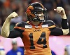
If anything, the 3rds should have been retained to lure younger fans. With his dark visor, Dante Marsh looked like a comic book Superhero, yet there was an homage to the past with the paw logo on the helmets and the dark jerseys.
DH
Roar, You Lions, Roar