
Athletes are superstitious types. They believe in a whole bunch of things from not cutting their hair or shaving during the playoffs, or doing some sort of OCD routine before every game. They believe that to vary from their routine will bring them bad luck and they will lose. Here's something that might be a little different - the Curse of the Helmet.
Our BC Lions were, well let's face it, not very good when they were a fledging team. They wore an orange helmet with a wide brown stripe and smaller white stripes. We never won a championship with that helmet or its variations. For a short time we had a Michigan Wolverines style helmet but never gave it a chance. Then came the famous Lion's Paw design and in 1964, a Grey Cup. We never won again with that design, or any variation of it. That was followed by a nice design (and variations) in the 1970's but we never won the cup in that decade. A drastic change was made in 1978 when we went to a white helmet, with stripes, with the first version of the current logo (with colours reversed) and in 1985 we won our second Grey Cup. We never won again with that helmet. In 1990 the logo was redesigned and we went with a silver helmet with an orange stripe, outlined in black and we won wearing that helmet in 1994. In 1995 the stripe was removed from the helmet and we won with that design in 2000. We tried again and again, but couldn't win a second time with that helmet. Sounding familiar? In 2005 we went to the current white helmet and made a subtle change in the logo (the lion's whisker holes were removed). Guess what? We won the cup in 2006.
Well here we are 3 full seasons later and no second Grey Cup with this helmet. Granted, we wore a few other "special" helmets these past few seasons, but they were basically rehashes of the 1960's design. Is there a helmet curse? Can we only win one championship with any given design? is it time for a new helmet design? Maybe if we just added some stripes? Or is this the year that we finally end the curse once and for all.....???
The Curse of the Helmet
Moderator: Team Captains
-
BCLions4Ever
- Rookie
- Posts: 67
- Joined: Mon Aug 24, 2009 6:35 pm
- Location: Powell River - home of Ted Gerela
-
TheLionKing
- Hall of Famer
- Posts: 25412
- Joined: Sat Feb 19, 2005 10:13 pm
- Location: Vancouver
squishy35 wrote:Cool observation....
I say get rid of the damn piping on the current jerseys and make the helmets black with the orange paw all season long......
You want another statistical anomoly? While the club wore this jersey (see below) with 7 orange stripes down the sleeves for the 1970 and 1971 seasons only, they saw a huge spike in attendance those two years. Then saw a big decline in the two years that followed when they switched to orange jerseys - not too unlike today's! Yet their won-loss record for '70 and '71 was nothing to write home about compared to the two seasons before and the two seasons after.
Here's what I mean.
1968 - 4-11-1 (.281) 25,723
1969 - 5-11 (.313) 26,482
1970 - 6-10 (.375) 30,978
1971 - 6-9-1 (.406) 28,225
1972 - 5-11 (.313) 23,199
1973 - 5-9-2 (.375) 25,567
Weird, huh?
DH
Here's what I mean.
1968 - 4-11-1 (.281) 25,723
1969 - 5-11 (.313) 26,482
1970 - 6-10 (.375) 30,978
1971 - 6-9-1 (.406) 28,225
1972 - 5-11 (.313) 23,199
1973 - 5-9-2 (.375) 25,567
Weird, huh?
DH
Roar, You Lions, Roar
-
BCLions4Ever
- Rookie
- Posts: 67
- Joined: Mon Aug 24, 2009 6:35 pm
- Location: Powell River - home of Ted Gerela
I don't think we'll see the paw design this season, as it will be "retro '70s" this season. My insider information suggests there will be a modernized version of the 1970's design used for a few games this year. Seeing as that is the only design (with a logo on it) that we never won a championship with, it could be bad luck to go down that road. Then again I think the problem in the '70s had more to do with coaching. That helmet never won us a cup, and the curse seems to be more about us only being able to win one championship for each helmet design. Maybe this season the 1970's design will be redeemed.
I'd be happy to lose that jersey piping as well - looks like a square dancer's shirt.
I'd be happy to lose that jersey piping as well - looks like a square dancer's shirt.
You do not have the required permissions to view the files attached to this post.
-
BCLions4Ever
- Rookie
- Posts: 67
- Joined: Mon Aug 24, 2009 6:35 pm
- Location: Powell River - home of Ted Gerela
They will probably use the same decal design, but they will be on the Schutt and Riddell Revolution helmets. The same as what they did last year with the "paw" helmets.
-
Lions4ever

- Hall of Famer
- Posts: 3430
- Joined: Wed Oct 02, 2002 7:25 pm
- Location: Vancouver Island
I wish the Lions would smarten up and just put David in charge of this stuff. Either that or me. 
-
SammyGreene

- Team Captain
- Posts: 8362
- Joined: Sun Oct 06, 2002 11:52 am
This is what Lions communications director Jamie Cartmell had to say about this season's retro on Twitter last week:

Now que David to give us an idea what it will look like.Kato has brought up a crested Geroy Simon retro jersey..looks Sweet. Can't do a pic but picture the '76 version minus the 'long sleeves'
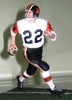
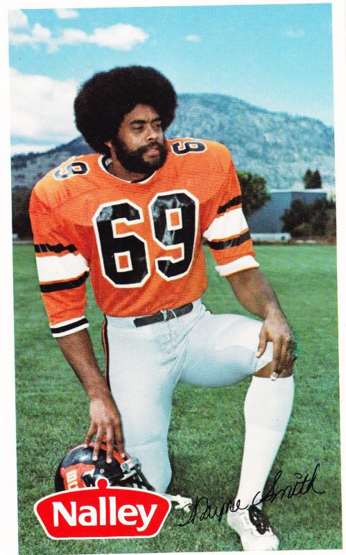
Of all the Leos' uniforms from 1970 - 1979, I like the '70-'71 uni best (see above). However, '76 and '77 one was a very close second. And you can't beat the Wayne Smith 'fro that went with it, dig?SammyGreene wrote:This is what Lions communications director Jamie Cartmell had to say about this season's retro on Twitter last week:Now que David to give us an idea what it will look like.Kato has brought up a crested Geroy Simon retro jersey..looks Sweet. Can't do a pic but picture the '76 version minus the 'long sleeves'
They wore the same black "snarling lion" helmets, but the jerseys were orange with black numbers and three stripes on each sleeve - one big white one surrounded by two smaller black ones. Pants were silver (off white) with burnt orange/black stripe down the leg.
I will be very happy to see this uniform again. Fantastic memories of the '77 Cardiac Kids.
DH
Roar, You Lions, Roar
-
SammyGreene
- Team Captain
- Posts: 8362
- Joined: Sun Oct 06, 2002 11:52 am
Love the fro! Maybe Geroy and some of the boys will grow their hair out for the retro season. 
Jersey looks similar to what we saw for the 50th anniversary game in 2003. The helmet/logo from that era is my favourite and really hope we get to see that as well.
Jersey looks similar to what we saw for the 50th anniversary game in 2003. The helmet/logo from that era is my favourite and really hope we get to see that as well.
You do not have the required permissions to view the files attached to this post.
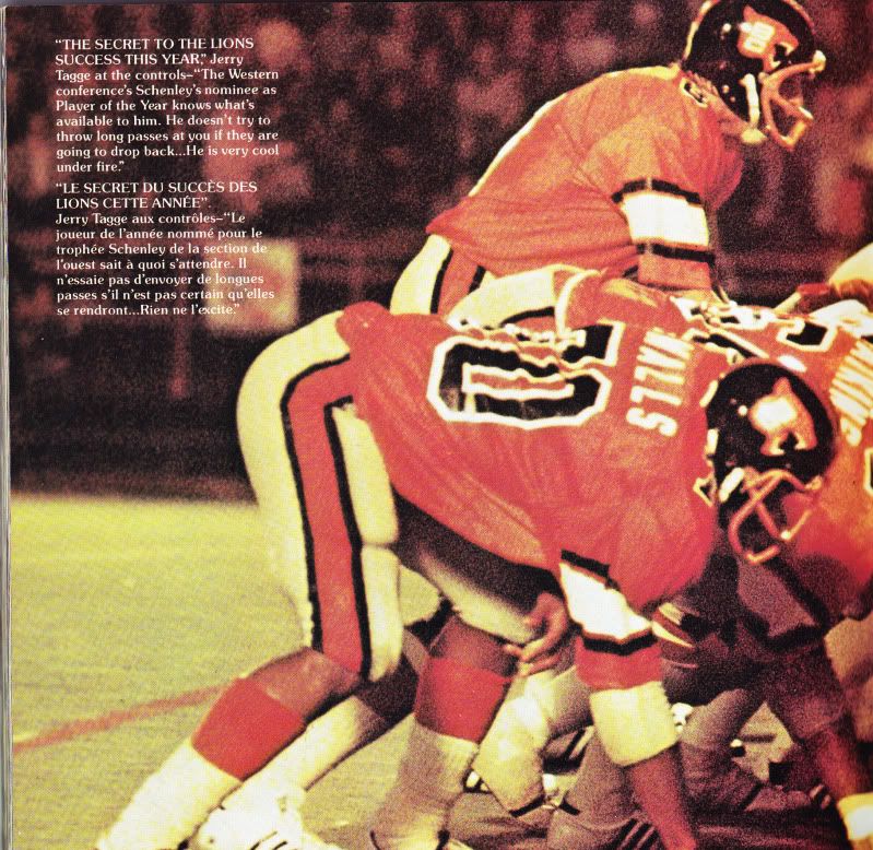
Here is a better shot of the 1977 uniforms that I think they're going to play a couple of games in this year at Empire.
Jerry and The Cardiacs. A magical year, 1977. Jerry Tagge rescued the club from the doldrums. One improbable finish after another. Somehow, some way he'd find Jim Young in the dying seconds for a touchdown or to set up Lui for the winning field goal. 10-6 record and a victory at home in the West Semi. One of my favourite years as a Lions fan!
DH
Roar, You Lions, Roar
-
BCLions4Ever
- Rookie
- Posts: 67
- Joined: Mon Aug 24, 2009 6:35 pm
- Location: Powell River - home of Ted Gerela
You do not have the required permissions to view the files attached to this post.
-
BCfanInDIXIE
- Starter
- Posts: 223
- Joined: Mon Dec 05, 2011 3:07 pm
- Location: Alabama
- Contact:
the current white helmet with the current BC logo on it and nothing else is my favorite. it is simplistic and distinct. I pray we stick with it.
Founder of the Bama BC Fan Club 