
Uniforms for Sept. 13 game
Moderator: Team Captains

Re: Uniforms for Sept. 13 game
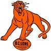
Yes the intro of the letters on the helmet started at the end of last year and has continued to be pushed forward.... not a fan of it. or that new font on the suddenly "alt" logo..
Re: Uniforms for Sept. 13 game
If someone is a fan of the monogram "BC" on the helmets, please step forward. No judgment. I'd love to meet you. Because I have yet to meet ANYONE who's in favor of that on our helmets over the traditional logo.yukonlion wrote: Fri Sep 13, 2024 8:57 am Yes the intro of the letters on the helmet started at the end of last year and has continued to be pushed forward.... not a fan of it. or that new font on the suddenly "alt" logo..
These constant uniform changes are invariably a solution looking for a problem.
DH
Roar, You Lions, Roar
-
Hambone

- Hall of Famer
- Posts: 9046
- Joined: Mon Nov 01, 2004 10:25 pm
- Location: Living in PG when not at BC Place, Grey Cup or Mazatlan.
Re: Uniforms for Sept. 13 game
I wouldn't count myself a fan of them but at the same time I don't at all dislike them.David wrote: Fri Sep 13, 2024 11:25 amIf someone is a fan of the monogram "BC" on the helmets, please step forward. No judgment. I'd love to meet you. Because I have yet to meet ANYONE who's in favor of that on our helmets over the traditional logo.yukonlion wrote: Fri Sep 13, 2024 8:57 am Yes the intro of the letters on the helmet started at the end of last year and has continued to be pushed forward.... not a fan of it. or that new font on the suddenly "alt" logo..
These constant uniform changes are invariably a solution looking for a problem.
DH
You're as old as you've ever been and as young as you're ever going to be.
-
Honour Dewalt
- Champion
- Posts: 533
- Joined: Wed Nov 27, 2002 11:21 pm
Re: Uniforms for Sept. 13 game
I don't find the monogram logo on the helmets too overly appealing. The only good thing about them is they gave the same direction on either side. Or rather, they don't have a lion that faces towards the back income side. The Lion logo that would be better is the 70s one, which would face forward on both sides. It still looks great to me but could be slightly updated if desired. But they never seem to want to lift up that logo too high.
I don't want anything with that new alt logo though. It looks like a cheap copy made by some ripoff company. I don't know who thought that was a good idea. I guess it fits with the idea to have too black uniforms in rotation though.
I don't want anything with that new alt logo though. It looks like a cheap copy made by some ripoff company. I don't know who thought that was a good idea. I guess it fits with the idea to have too black uniforms in rotation though.