
NEW JERSEYS UNVEILED...
Moderator: Team Captains

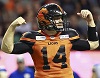
http://twitter.com/#!/BCLions/media/sli ... Foea0qklpj
'new' uniforms? - the removal of the piping is the only change, hardly worth a press conference, they should have just released photos.
how many people will buy a new jersey with such a minor change?
'new' uniforms? - the removal of the piping is the only change, hardly worth a press conference, they should have just released photos.
how many people will buy a new jersey with such a minor change?
I'm kinda hoping I can old an old one at clearance. I was hoping for SOMETHING different.dtrain wrote:http://twitter.com/#!/BCLions/media/sli ... Foea0qklpj
'new' uniforms? - the removal of the piping is the only change, hardly worth a press conference, they should have just released photos.
how many people will buy a new jersey with such a minor change?
-
Lions4ever

- Hall of Famer
- Posts: 3430
- Joined: Wed Oct 02, 2002 7:25 pm
- Location: Vancouver Island
Yes, good riddance to that dreadful piping, otherwise the roll-out is a total yawner.
-
No Ordinary Joe

- Legend
- Posts: 2165
- Joined: Thu Jul 05, 2007 5:26 pm
- Location: Delta
That's it? Pretty anticlimactic. I actually prefer them WITH the piping, just a hint of color to compliment the orange. I'll look for an "old" one on clearance somewhere.
Good luck on that. I've come up more or less empty online.No Ordinary Joe wrote:That's it? Pretty anticlimactic. I actually prefer them WITH the piping, just a hint of color to compliment the orange. I'll look for an "old" one on clearance somewhere.
-
Lions4ever
- Hall of Famer
- Posts: 3430
- Joined: Wed Oct 02, 2002 7:25 pm
- Location: Vancouver Island
My biggest nitpick with the piping was that it wasn't consistent. On some jerseys it was rounded at the shoulder, at some it was squared off. Looked silly and the complete antithesis of the concept of something being UNIform (other than name number and size, obviously). Ours wasn't quite as bad as the clown head look of the Stumps, but not that great either.

Some stripes on the sleeves would have been nice. Are they going with black numbers or white numbers. I prefer black numbers. I like that they stuck with orange as the primary color, but I don't like how it just looks like a plain orange Tshirt.
Beauty is in the eye of the beholder for sure. I can tell you that Argo fans, by and large, are thrilled with the new uniforms, especially the away ones. IMO, it is great to see both Toronto and Hamilton go to more classic looks.Blue In BC wrote:The TiCats jerseys get a pass. The other 3 are horrible and as a Bomber fan think theirs are the worst of the lot. Totally uninspired designs.
The Lions should have just gone with their 1970s retro jersey although these new ones are a slight improvement over their previous ones with the removal of that awful piping.almo89 wrote:Some stripes on the sleeves would have been nice. Are they going with black numbers or white numbers. I prefer black numbers. I like that they stuck with orange as the primary color, but I don't like how it just looks like a plain orange Tshirt.
Ravi wrote:Edmonton's home ones are very nice but their away uniform is not my cup of tea.squishy35 wrote:The eskimos jersey is up now..... It looks pretty nice......
Agreed.... I didn't see the away ones....... bleah!
I agree. The 70s retro was one of the best jerseys because it was simple. The black helmet along with the orange cage gave them a meaner look too. The 70s retro also lets the club keep orange as a primary color. For road jerseys, they should have when with the 60s retros. It would have been a sick combo.Ravi wrote:The Lions should have just gone with their 1970s retro jersey although these new ones are a slight improvement over their previous ones with the removal of that awful piping.almo89 wrote:Some stripes on the sleeves would have been nice. Are they going with black numbers or white numbers. I prefer black numbers. I like that they stuck with orange as the primary color, but I don't like how it just looks like a plain orange Tshirt.