
This is what the new jerseys look like just the east for now, tommorrow will be the west
http://www.cfl.ca/page/reebok
NEW JERSEYS UNVEILED...
Moderator: Team Captains
-
TheFanWithTheFlag

- Starter
- Posts: 123
- Joined: Mon Jan 16, 2012 8:46 pm
- Location: Burnaby

-
TheFanWithTheFlag
- Starter
- Posts: 123
- Joined: Mon Jan 16, 2012 8:46 pm
- Location: Burnaby
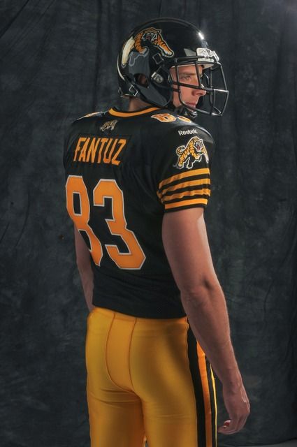
I think Hamilton looks ugly
Montreal not bad but not good
Winnipeg looks good to me
What do u guys think
I HOPE OURS LOOK GOOD I HAVE ONE ON PREORDER
Montreal not bad but not good
Winnipeg looks good to me
What do u guys think
I HOPE OURS LOOK GOOD I HAVE ONE ON PREORDER
jcalhoun wrote:First off, piping is what makes a cake look elegant, and more importantly it's delicious. So enough with the anti-piping agenda.
I think the new jerseys look....okay.
Anyone else notice that they've taken a page from baseball's designer, and the home unis have the team name, the away unis the city name? I kinda like that. Except of the three posted teams, Winnipeg decided not to play ball. Weird.
Cheers,
James
Piping is for cake............ I agree...... not for jerseys.....
now, enough of the anti piping agenda....

They should have made all the teams jersey's mid off season, as it always swings the vote to both ends of the spectrum. What better way to get the CFL discussed than to have fans of each team reacting to the new uniforms. For what it is worth, I don't care for what I see so far, cross my fingers that the Lions hit gold on their uni's. But no matter what, there will be those that won't care for them.
Entertainment value = an all time low
-
Coast Mountain Lion

- Legend
- Posts: 1377
- Joined: Sun Nov 16, 2008 4:52 pm
- Location: Champlain Heights
I'll reserve judgement until I see them with numbers on them. Too hard too tell otherwise.
-
Sir Purrcival

- Hall of Famer
- Posts: 4626
- Joined: Sat Aug 23, 2003 11:48 am
- Location: Comox Valley
They really look very simplified which I don't mind. They will fill up with the numbers name bars and the inevitable advertising patch and what not. Can't say they wow me or look worse. More like a 'meh'
Tell me how long must a fan be strong? Ans. Always.
-
sasklionsfan
- Rookie
- Posts: 67
- Joined: Thu Jul 01, 2010 7:08 pm
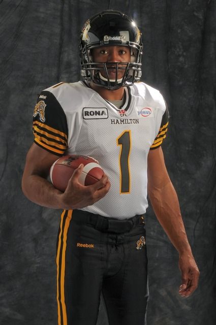
The Ticats and the Argos have jerseys with a bit of their retro jerseys along with their jerseys from last year. The Allouettes jersey looks almost the same, and the Bomber Jersey looks pretty awful. The Bombers really let the fans down with their new jerseys. Also anybody think its funny to see Burris in a Ticat uniform?

If it's a contest among the 3 teams that have unveiled new uniform designs thus far, Hamilton wins by a country mile. A simple, contemporary look with a nod to the past. Montreal, meh. Winnipeg = massive fail. In fact, if the reaction on OurBombers is any indication, the surly masses are ready to storm the Bomber offices with pitchforks and torches. 
If you replaced the yellow with orange and made these the Lions uniforms, I'd be pretty happy (except you'd need white pants at home, not orange).
DH
If you replaced the yellow with orange and made these the Lions uniforms, I'd be pretty happy (except you'd need white pants at home, not orange).
DH
Roar, You Lions, Roar
With the exception of the yellow pants (yellow pants, seriously?) I think Hamilton's combination is very, very good. It stresses the team logo, the numbers are on the shoulders and the front/back and the city/nickname appears below the neck. Unlike the Argos, the stripes are integrated seamlessly into the uniform itself. I could have done without the black sleeves on the away, but still, very good.
Montreal is uninspiring. I don't find the new ones to be an improvement on the old, and I didn't like the old. They've made the font on Montreal and Alouettes larger and more generic.
The Arena League called and would like Winnipeg's jerseys back. Those gold away jerseys are...unpleasant.
Toronto. Like Hamilton, I do like the Toronto Argonauts logo at the base of the neck, and the city/logo combo on the front. But the stripes don't seem quite as good on the Argos home jersey as they do on the away, I think I prefer the away white better on the Argos than I do on the home ones. The number styling is just ordinary. All in all, a bit of a disappointment.

-
Blue In BC
- Hall of Famer
- Posts: 3337
- Joined: Sun Mar 09, 2003 9:32 am
- Location: Port Moody, BC
The TiCats jerseys get a pass. The other 3 are horrible and as a Bomber fan think theirs are the worst of the lot. Totally uninspired designs.
-
TheFanWithTheFlag
- Starter
- Posts: 123
- Joined: Mon Jan 16, 2012 8:46 pm
- Location: Burnaby