New BC Lions Jersey for 2016

The Place for BC Lion Discussion. A forum for Lions fans to talk and chat about our team.
Discussion, News, Information and Speculation regarding the BC Lions and the CFL.
Prowl, Growl and Roar!

Moderator: Team Captains

Post Reply
User avatar
CardiacKid
Legend
Posts: 1949
Joined: Sat Jul 14, 2012 9:46 am
Location: Under Christmas Hill, Saanich

cromartie wrote:Then (on the right)
Image

Now

Image

Awesome. Then again, I freely acknowledge that I may be the only one to get the similarities.
b

What team are you referencing in that first photo?
User avatar
BC 1988
Legend
Posts: 1357
Joined: Sat Oct 26, 2013 1:58 pm
Location: BC (since 1988)

CardiacKid wrote:
cromartie wrote:Then (on the right)
Image

Now

Image

Awesome. Then again, I freely acknowledge that I may be the only one to get the similarities.
b

What team are you referencing in that first photo?
That is the 1983 USFL Michigan Panthers
http://www.usfl.info/panthers/archives.html

The black facemask buckle (which breaks up the orange, giving the effect of making it look like a knight chess piece) and the "Grey Cup championship" lines on the BC version detract from the execution of a great concept.
You do not have the required permissions to view the files attached to this post.
Qman
Champion
Posts: 933
Joined: Wed May 02, 2012 12:59 pm
Location: Section 240

cromartie wrote:Then (on the right)
Image

Now

Image

Awesome. Then again, I freely acknowledge that I may be the only one to get the similarities.
no your aren't. Its clearly an homage ... a number of people have said this yesterday.
User avatar
almo89
Legend
Posts: 2232
Joined: Wed Jun 18, 2003 2:51 am
Location: Coquitlam

I would like to see some tweaks to an already solid jersey in the future. Tramp stamp needs to go. The riders had it on their last jersey and it was panned by their fans. Not sure why the Lions thought it was a good idea. Maybe there was pressure from management to include the logo because the helmet doesn't show it. It tells me that the team is still very loyal to the traditional BC logo. It would be nice to see them use the black lion with orange BC lettering from the 80s but that's another discussion. Another tweak I would like to see is go back to the skinnier font for the name bar of our last jersey. The current font makes people with short last names look long. People with long last names will look brutal. They need to find a way to make the name bar blend in with the jerseys better without covering the piping. Skinnier lettering will help it a little. The road unis hasn't been as well received but they are starting to grow on me. It looks simple and has that old tampa bay bucs look to it. They did a great job overall in not making the jerseys too busy. Looks simple and modern at the same time.
vanhalendlrband
Rookie
Posts: 34
Joined: Sat Nov 03, 2007 5:07 pm

Best jersey they ever made. Most people love it, 76% on the team liked it and social media loved it
User avatar
cromartie
Hall of Famer
Posts: 5005
Joined: Thu Oct 03, 2002 2:31 pm
Location: Cleveland, usually

vanhalendlrband wrote:Best jersey they ever made. Most people love it, 76% on the team liked it and social media loved it
I'm glad the love is out there. I do think that all three previous alternates, the gun metals, the 1970s retros and the mid 2000s version the Cincinnati Bengals stole, are better, however.
User avatar
CardiacKid
Legend
Posts: 1949
Joined: Sat Jul 14, 2012 9:46 am
Location: Under Christmas Hill, Saanich

cromartie wrote:
vanhalendlrband wrote:Best jersey they ever made. Most people love it, 76% on the team liked it and social media loved it
I'm glad the love is out there. I do think that all three previous alternates, the gun metals, the 1970s retros and the mid 2000s version the Cincinnati Bengals stole, are better, however.
Yes, I agree that regardless how I personally feel about the revamp (and I am still not sure how I feel), I am glad that there are folks who are stoked by the jerseys. The deed has been done and there is really no going back now for this season; in the best interest of, and in the betterment of the Lions, the new jerseys need to be successful.

Certainly there are fans out there who appreciate the fact the Lions instituted a change and are pissed with teams like the Als and TiCats who did very little in altering their jerseys.
Rocko604
Rookie
Posts: 53
Joined: Thu Aug 06, 2015 11:15 pm

I already commented in the poll question thread, but I like them overall. I was hoping for something akin to the 70s retro jerseys, and orange with black numbers does that. Just wish the shoulders were orange as well and they had some white outline on the numbers. Don't like the straight black on orange.
User avatar
David
Team Captain
Posts: 9369
Joined: Thu Oct 03, 2002 10:23 am
Location: Vancouver (Kitsilano)

David wrote:I'd love to be wrong, but I've got a sinking feeling that there's going to be a lot of pissed off Lions fans coming to this board next month to commiserate once the new Adidas jerseys are unveiled. Why? Well, first, they took a really good idea (the gun metal 3rds) and buried it faster than Jimmy Hoffa. Sure, they may have been an announcer's worst nightmare (the numbers could have easily been tweaked), but the players and most fans loved them. Except Skulsky.

And therein lies my pessimism. I don't trust his fashion sense.

Just go to any outlet that sells Lions gear. BC Place, Sports N Stuff, YVR, online - you name it - and you'll see 50 different shades of orange on Lions gear. Brownish orange, bright orange, burnt orange....basically every different orange pantone - it's a mess. The club is so sloppy in what it allows its licensed goods manufacturers to produce, it shows me there's no QC at the top. Add in the panic and poor decision making that losing organizations with dwindling fan bases seem to make, and the club's pandering to win over younger fans, and this spells potential disaster.


DH :cool:
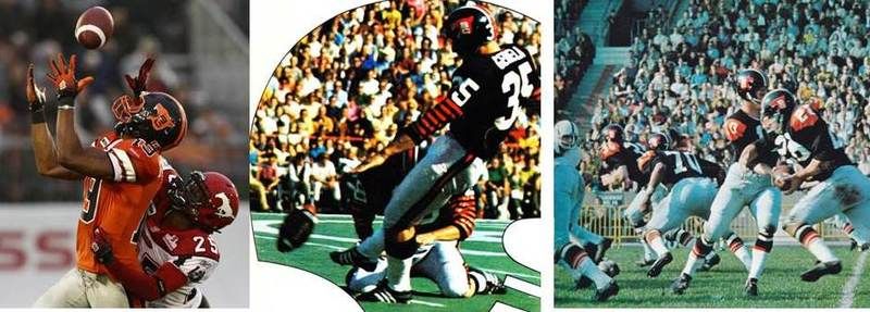
I don't like quoting myself as it comes across as self-aggrandizement, but I wasn't far off the mark with this gut feeling. Now, I realize most of the concern last night wasn't justified as they won't normally be wearing the orange lids with the home jersey. I get it. But I would hardly say the uniform unveiling has been a home run thus far, regardless of age or number of years supporting the club.

I have to admit I got my hopes up when Biggie and another CFL player called the sneak peek look 'sick.' Guess they hadn't seen the away uniform. I really wish the club could settle on a design and stick with it instead of changing it every 7 or 8 years. That's one thing I respect about the iconic franchises in sport - the Packers, the Canadiens, the Yankees - they don't keep effing with the uniforms! Here are the uniforms I really wish the Lions had kept - any one of these 3. Below shows the 2010 retro which they originally wore in 1976 and 1977, next is 1970 and 1971, and the 3rd image the club wore from 1964 - 1969. Hint. All simple designs.

Image


DH :cool:
Roar, You Lions, Roar
User avatar
WestCoastJoe
Hall of Famer
Posts: 17721
Joined: Mon May 22, 2006 8:55 pm

Good pix, David.

For this fan, the numbers on each of those uniforms stand out clearly. Pow. You don't have to look hard to get the number.

Simplicity is key. Designers try to justify their work with complexity, stretching the limits, mixing in fashion sense. For this fan, it does not work.

Get the number. Have team identity. Have strong colour combinations. Have clear symbols and logos.

* numbers easy to read

* instant recognition of the team

* clear symbols and colours

Minimalist, in some cases, I admit.
You do not have the required permissions to view the files attached to this post.
John Madden's Team Policies: Be on time. Pay attention. Play like hell on game day.

Jimmy Johnson's Game Keys: Protect the ball. Make plays.

Walter Payton's Advice to Kids: Play hard. Play fair. Have fun.
User avatar
WestCoastJoe
Hall of Famer
Posts: 17721
Joined: Mon May 22, 2006 8:55 pm

For this fan, these helmets are about as bad as it can get.

The jerseys? Not sure. Not sold. Black numbers front and back. Orange numbers on the shoulder. Ughhh

The pants? Not sure. Not sold.

Modern fashion? Ughhhh
You do not have the required permissions to view the files attached to this post.
John Madden's Team Policies: Be on time. Pay attention. Play like hell on game day.

Jimmy Johnson's Game Keys: Protect the ball. Make plays.

Walter Payton's Advice to Kids: Play hard. Play fair. Have fun.
TheLionKing
Hall of Famer
Posts: 25103
Joined: Sat Feb 19, 2005 10:13 pm
Location: Vancouver

I would have prefer a plain black pants. Don't know what the orange patch on the knees is supposed to represent.
footballtom
Rookie
Posts: 99
Joined: Mon Jun 13, 2016 12:09 pm

WestCoastJoe wrote:For this fan, these helmets are about as bad as it can get.

The jerseys? Not sure. Not sold. Black numbers front and back. Orange numbers on the shoulder. Ughhh

The pants? Not sure. Not sold.

Modern fashion? Ughhhh


They would look better with the black helmets all those lines under the lion on the helmet do not need to be there but I love the jerseys.
User avatar
KnowItAll
Hall of Famer
Posts: 7458
Joined: Mon Aug 16, 2004 6:32 pm
Location: Delta

helmet is neither good or bad

can live with the jersey

hate the black leotards
Every day that passes is one you can't get back
User avatar
CardiacKid
Legend
Posts: 1949
Joined: Sat Jul 14, 2012 9:46 am
Location: Under Christmas Hill, Saanich

Heard a rumour at tonight's game from a highly placed source (okay she was sitting in the row above us) that there will be a third jersey released this year. Apparently it will be mostly black....perhaps a nod to the gun metal jerseys that I would say was easily the most plentiful in the stands tonight. Still lovin' mine, especially now it is rock in' a Tagge nameplate.
Post Reply