
I wouldn't say they've done a great job with their brand identity. Yes, they have embraced orange, but you don't even have to go to a sports store to see the discrepancy in shades. I've seen it on the sidelines, with hats and jackets etc. I've seen it in official Lions marketing material. Lighter shades of orange mixed with the darker burnt orange.
Another problem area is the numerous fonts used. A brand identity also carefully follows certain font guidelines. Every time you see something from the Lions, they should be following these, so that without even thinking about it, you know it's the Lions. Look at their website. The logo has a font that has been used forever. But I'm not sure if that particular font is used anywhere else. Maybe the name plates, but I can't tell. The worst area is in the Lions store. Every piece of merchandise looks different, like nobody had any brand awareness.
I really think they should be much more strict on the shade of orange being used, and the fonts.
All that being said, I'm anxious to see the latest jersey. I feel they have tried to keep things pretty traditional with the main uniform over the past ten years, and I hope that continues to some degree. I don't think they should stray too far away from tradition, but the last jersey, (even though I like it and bought one or two) was so simple, like they took the design (not colours) of the Oakland Raiders, who basically just have a plain black jersey if you don't put any numbers on it. Ours was the plain orange version of that.
I just don't want them going too far the other way, and with Dennis in charge, I doubt they will. We'll see.
New BC Lions Jersey for 2016
Moderator: Team Captains
Honour Dewalt wrote:I wouldn't say they've done a great job with their brand identity. Yes, they have embraced orange, but you don't even have to go to a sports store to see the discrepancy in shades. I've seen it on the sidelines, with hats and jackets etc. I've seen it in official Lions marketing material. Lighter shades of orange mixed with the darker burnt orange.
Another problem area is the numerous fonts used. A brand identity also carefully follows certain font guidelines. Every time you see something from the Lions, they should be following these, so that without even thinking about it, you know it's the Lions. Look at their website. The logo has a font that has been used forever. But I'm not sure if that particular font is used anywhere else. Maybe the name plates, but I can't tell. The worst area is in the Lions store. Every piece of merchandise looks different, like nobody had any brand awareness.
I really think they should be much more strict on the shade of orange being used, and the fonts.
All that being said, I'm anxious to see the latest jersey. I feel they have tried to keep things pretty traditional with the main uniform over the past ten years, and I hope that continues to some degree. I don't think they should stray too far away from tradition, but the last jersey, (even though I like it and bought one or two) was so simple, like they took the design (not colours) of the Oakland Raiders, who basically just have a plain black jersey if you don't put any numbers on it. Ours was the plain orange version of that.
I just don't want them going too far the other way, and with Dennis in charge, I doubt they will. We'll see.
^^ agree with this 100%. The more simplistic the Jersey's the better (IMO) anyway. I would like to see this across the league. The Stamps' Unis have been very messy for the past several seasons.... Likewise the many various versions of the 'Riders' Uniforms.
Penton, toronto sun:
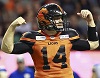
Roughriders defensive end Shawn Lemon had this review of the CFL's new Adidas uniforms, which will be unveiled May 12 in Montreal: “B.C. won. B.C. by far has the best uniforms. They're slick. They're nice.”
Roughriders defensive end Shawn Lemon had this review of the CFL's new Adidas uniforms, which will be unveiled May 12 in Montreal: “B.C. won. B.C. by far has the best uniforms. They're slick. They're nice.”
roar report on twitter:
Roar Report @RoarReport 17 minutes ago
Roar Report Retweeted CFL News
more positive #bclions jersey leaks ... 21 more days!
CFL News @CFL_News
RT .@Bighill44
Btw.... The new #BCLions unis are pretty sick... Just saying... #savage #cfl
Roar Report @RoarReport 17 minutes ago
Roar Report Retweeted CFL News
more positive #bclions jersey leaks ... 21 more days!
CFL News @CFL_News
RT .@Bighill44
Btw.... The new #BCLions unis are pretty sick... Just saying... #savage #cfl

Maybe that's a reflection of how bad the other teams' new unis are.Qman wrote:Penton, toronto sun:
Roughriders defensive end Shawn Lemon had this review of the CFL's new Adidas uniforms, which will be unveiled May 12 in Montreal: “B.C. won. B.C. by far has the best uniforms. They're slick. They're nice.”
I agree with others who have said the simpler the design the better. (PLEASE no more logos on the front like the Argos 3rds last season).
I bet you the reason they say traditionalists are gonna hate them is because they are going with the all options included route.
I wouldn't be surprise if our jerseys and busy with the bells and whistles like the Seahawks have on their Nike ones.
Just my guess.
I wouldn't be surprise if our jerseys and busy with the bells and whistles like the Seahawks have on their Nike ones.
Just my guess.
-
SammyGreene

- Team Captain
- Posts: 8082
- Joined: Sun Oct 06, 2002 11:52 am
I tend to agree. I don't think Lemon or others would be signalling out the Lions jersey if it was basically the same look as Reebok home and aways. I wonder if the combine jerseys provided a hint of what we will see in three weeks.Spud387 wrote:I bet you the reason they say traditionalists are gonna hate them is because they are going with the all options included route.
I wouldn't be surprise if our jerseys and busy with the bells and whistles like the Seahawks have on their Nike ones.
Just my guess.
You do not have the required permissions to view the files attached to this post.

Is that supposed to be flames, autumn leaves or just some Jackson Pollockesque abstract colour pattern?
Sports can be a peculiar thing. When partaking in fiction, like a book or movie, we adopt a "Willing Suspension of Disbelief" for enjoyment's sake. There's a similar force at work in sports: "Willing Suspension of Rationality". If you doubt this, listen to any conversation between rival team fans. You even see it among fans of the same team. Fans argue over who's the better QB or goalie, and selectively cite stats that support their views while ignoring those that don't.
-
Lions4ever

- Hall of Famer
- Posts: 3430
- Joined: Wed Oct 02, 2002 7:25 pm
- Location: Vancouver Island
I thought those looked fantastic, especially in the whites.BC 1988 wrote: (PLEASE no more logos on the front like the Argos 3rds last season).
Yes, the whites retro style (going back to the '60's) was good, but then they had to go and put the big "A" logo on the front. The same thing with EDM 3rds, a gigantic logo on the front of what was otherwise not a bad uni.Lions4ever wrote:I thought those looked fantastic, especially in the whites.BC 1988 wrote: (PLEASE no more logos on the front like the Argos 3rds last season).
Thanks for that. From the quick glimpse, it looks like they will be "freshening" the logo (which I don't actually have a problem with doing, just as long it's not on the front of the jersey.)Spud387 wrote:Quick Teaser Video.
Also there appeared to be solid colors, no Jackson Pollock style (thanks sj-roc) abstractions like in the combine unis.
-
TheLionKing
- Hall of Famer
- Posts: 25103
- Joined: Sat Feb 19, 2005 10:13 pm
- Location: Vancouver
Not much of a tease.
